Lightroom Tutorial: Enhance Your Milky Way Photos The Easy Way
Get link
Facebook
X
Pinterest
Email
Other Apps
Combine a few simple techniques in Lightroom and you’ll soon bring out the stellar detail in your Milky Way photos
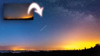
Shooting the Milky Way needs a lot of luck with cloudless skies. Even then, what shows up on-screen can be a sad reflection on what we actually saw with our eyes!
Welcome to the 11th instalment of our Lightroom series, first published in Digital Camera magazine (see below for subscription offers).
If you are already a Lightroom user, you could discover some new tricks and processes you haven't tried yet. If you don't use Lightroom, then scroll down to the bottom where you'll discover how to get it and which Adobe Photography Plan is best.
Note: This was written for Lightroom 6. Some of the tools and panels have changed in later versions, notably the Chromatic Aberration Removal option (now a simple checkbox) and the Dehaze slider (now in the Basic panel).
It’s good to know that you can rely on Lightroom to help bring impact to the faint glow of our galaxy’s core. For this we’ll use a mix of tools: the Basic panel, the Lens Corrections panel and the Adjustment Brush. The base image is of the Milky Way with the International Space Station passing by.
1. Adjust the color
(Image credit: Sean McCormack)
We’ll begin in the Basic panel, and start with the color. As there’s yellow light pollution in this shot, moving the Temperature slider makes the sky more blue, while reducing the impact of the sodium lighting. This also brings more balance to the complementary colours here.
2. Highlights and Exposure
(Image credit: Sean McCormack)
Push the Whites slider to ensure that the stars are fully white. For a stronger silhouette on the ground, reduce the Blacks. Finally, use Exposure to set the overall brightness.
3. Remove the color fringing
(Image credit: Sean McCormack)
As astrophotography is generally shot at wider apertures, you see more of the lens's vignetting effects and chromatic aberration. Go to Lens Corrections and turn on Remove Chromatic Aberration. Next, go to Manual, grab the eyedropper and click on the edge of a star with obvious edges. This removes the colour on the edges of the stars.
4. Correct distortion
(Image credit: Sean McCormack)
Next, click Enable Profile Corrections. This will correct lens distortion and fix the darkening of the corners in the photo, using a profile dedicated to the lens used. For astro-photography, I find it overdoes this fix, so you may need to reduce the effect by moving the Vignetting and Distortion sliders down to taste. This balances out the color and stops the stretching of stars at the corners a little.
5. Add some punch
(Image credit: Sean McCormack)
A great way to increase punch in an astro-photo is to increase the Dehaze slider, which is located in the Effects panel. A small amount does wonders to add contrast and saturation in the image.
6. Add depth
(Image credit: Sean McCormack)
The final global tool we’ll use is the Clarity slider, which you can find in the Basic panel. Increasing this really helps to bring out depth in the Milky Way. Too much of it can mush up the rest of the image, though, so be careful not to overdo it.
Expert tip: Paint in more depth
(Image credit: Sean McCormack)
Clarity looks good on the sky, but it’s too much for most of the image. Instead, click the Adjustment Brush under the Histogram (or press K). Double-click the word Effect to reset all the sliders and the swatch. Now set Clarity to 25 – that’s low, but it’s better to build the effect up. Set Feather to 100 for a soft edge. Set Flow and Density to 100 to get the full effect. Set the size to cover one half of the Milky Way. Brush along each half. Press New and repeat. Repeat again. Alternatively, right-click the active pin after the first round of brushing and choose Duplicate to double the effect. Hold down the Alt key to erase areas where you don’t want the effect after you’ve painted.
PhotoScape X is a hidden gem. I have been using it for years now and have never bothered to replace it with any other photo-editing software . You may ask why. Well, because it has everything one can ask for in an image editing software. With over 1000 filters and effects, 100+ tools, 200+ shapes, stickers, and figures, the PhotoScape X editor is mind-blowing. And the best part — most of the functions are free. Worth Reading: Everything You Should Know To Effectively Use Photoshop’s Background Eraser Tool Every time you use it, you discover something new. So to save your time, we have compiled top 13 PhotoScape X tips and tricks. We are leaving out the aspects of using the effects, filters, and tools since PhotoScape has a huge library of videos on them. Here we will cover the features that require quite a bit of exploring to discover and experimenting to understand how they work. NOTE : PhotoScape has two versions — PhotoScape 3.7 and PhotoScape X. The former one is for th...
When you come back from a trip and have tons of photos, I am sure you must have thought of one big photo which can have some of the memorable pictures together. Yes, I am talking about a Collage, and in this post, I will share free Photo Collage makers . I will list online tools and software which can do the job for you. Rest assured that the collage you downloading or saving using these tools will not have any watermark. Free Photo Collage maker While these are free, they do have limitations. Some of them will not let you use all the templates, while some will only make you use a set of templates. Since we have four in the list, use a combination of them to get desired results. Adobe Spark BeFunky Fotojet Photoscape We researched a lot of software, but most of them either limited or leave a watermark. We even downloaded software which claimed to have no limitations but turned out to have a trial period. So these are your best options. 1] Adobe Spark It ...
Let’s face it. Half the articles sharing “the top tips” for you to capture better landscape images are rather generic. Sure, straightening the horizon and photographing during Golden Hour may have a positive impact on your photos, but will they make you a better photographer? Instead of looking at those basics, I want to share 7 slightly different but equally important suggestions. These tips aren’t going to instantly improve your photography, but they’re aimed at making you a better photographer . Take the time to learn and try them, and I think you’ll start seeing a difference in the near future. #1. Good Light is NOT Limited to the ‘Golden Hour’ I wasn’t going to talk about the Golden Hour in this article, but it’s such a common piece of advice that I can’t help bringing it up. While most people (myself included some years ago) say that you need to photograph during sunrise or sunset to get better images, I’m going to argue that this is not the case. Good light can happ...


Comments
Post a Comment